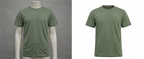
Illustrative example. Left: raw photo with a color cast. Right: corrected to the approved color.
Your catalog may have a color consistency problem
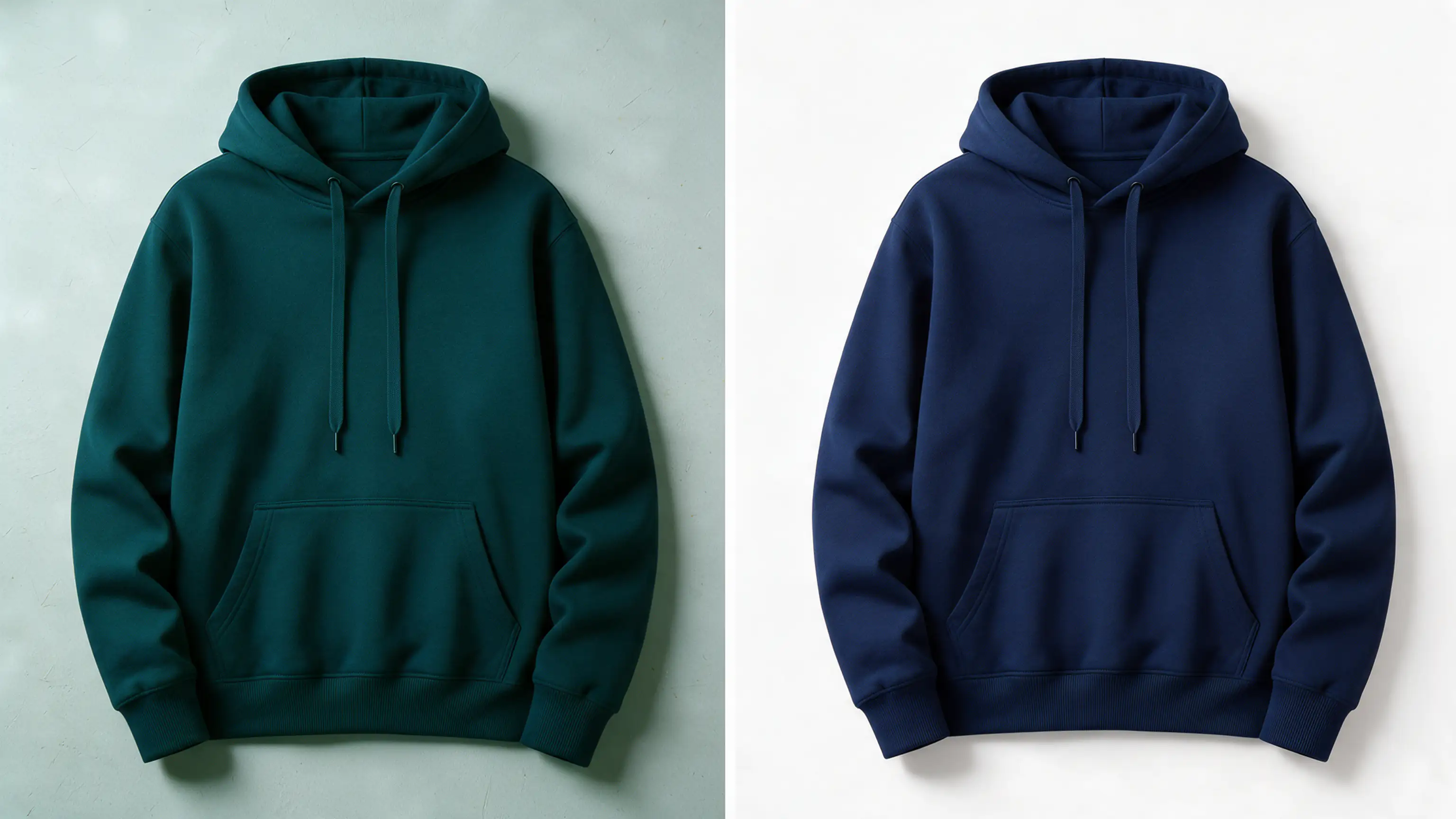
You open your store and scroll through a collection. The navy hoodie looks teal. The "same" navy in the next row looks almost black. The red variant came from a different shoot, so it sits brighter than everything around it.
No single image is necessarily wrong. The problem appears when they sit together. Mismatched colors make a catalog look less managed, and they can make it harder for shoppers to judge what a product will look like in person. Consistent ecommerce product images start with consistent color.
This is a catalog consistency problem more than a Photoshop problem, and it grows with every SKU you add. It is closely related to the visual drift that often shows up after a professional shoot, which we cover in our guide to fixing inconsistent product photos after a professional photoshoot.
Why product colors drift apart
Color rarely goes wrong in one dramatic way. It drifts, shoot by shoot.
- Lighting changes. A softbox in March and window light in June produce two different whites.
- Cameras differ. Two bodies or lenses record the same fabric differently.
- White balance shifts. A slight warm or cool cast changes how every color reads.
- Variants are shot separately. Each colorway becomes its own mini project with its own setup.
- Editing is not standardized. Different editors, or the same editor on different days, apply different treatments.
Multiply that across 20 products with 5 colors each, and you have 100 images that need to agree with each other.
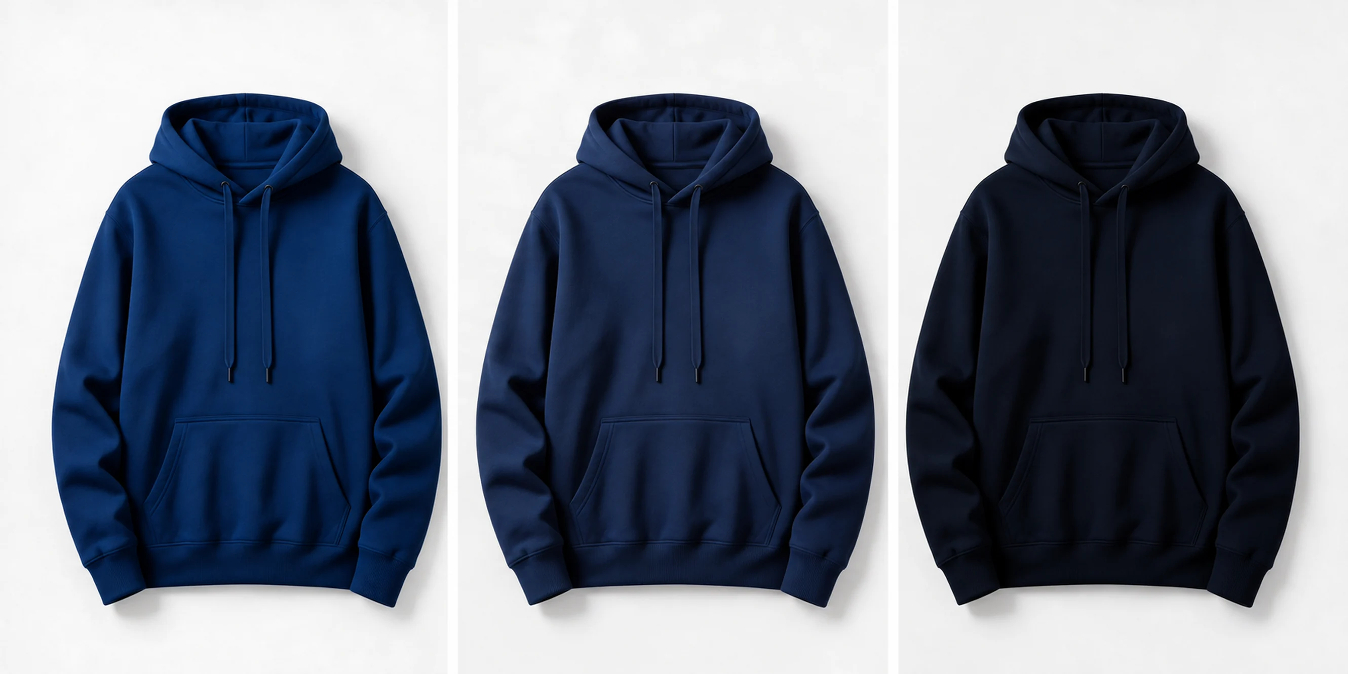
Illustrative example. The same product photographed in three separate shoots.
What consistent catalog color depends on
Editing cannot make a color look identical on every shopper's screen. Displays differ in brightness, calibration, and color gamut, and no editor controls that. What a good workflow can do is make sure the files themselves are accurate and consistent, so any display shows them as close to the intended result as possible.
Consistent catalog color depends on five things:
- A reliable reference. A physical swatch, a product sample, or an approved digital master. Without one, "correct" is just opinion.
- Consistent editing conditions. A calibrated display and a controlled viewing environment, so the editor judges color the same way on every file.
- Appropriate color space and export settings. Files should be converted to the color space your sales channels expect, usually sRGB for web, rather than left in whatever the camera or editor produced.
- Side-by-side comparison. Judging images in a grid, next to their siblings, catches mismatches that single-image review misses.
- Realistic expectations. The goal is accurate files and a consistent set, not pixel-identical appearance on every device.
What color correction actually fixes
Product color correction brings each image back to what the physical product looks like. Done properly, it is color matching against an approved standard, not a quick saturation tweak. A careful edit follows four steps:
- Set the reference. Use an approved swatch, sample, or master image.
- Correct exposure and white balance. Remove the color cast so neutrals are neutral.
- Match the product to the reference. Adjust hue, saturation, and brightness until the product matches the approved color.
- Compare across the set. Check the image next to the others on the page, not just on its own.
Step 4 is where many edits fall short. An image can look right alone and still clash with the images around it.
Start variants from a corrected master
If you create color variants, the order of work matters more than any single editing technique:
Original photography → color correction → approved master → color variants → catalog-level QA → final export
The corrected, approved master is the foundation. If you recolor an uncorrected image, every variant inherits its problems. A warm cast, a crushed shadow, or an off-white background gets copied into each new colorway, and you end up fixing the same flaw five times instead of once.
Correct the original first. Get the master approved. Then build variants from that file, so every colorway starts from the same accurate base.
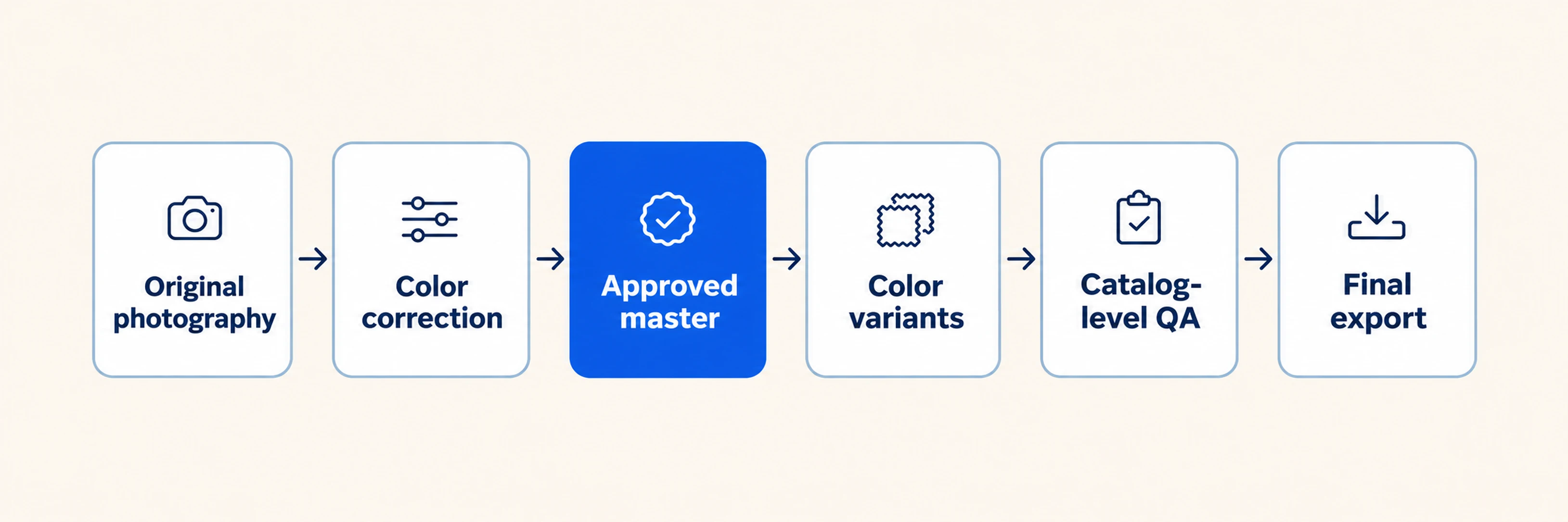
Variants start from the corrected, approved master, not the original photo.
What should you provide as a color reference?
The better the reference, the less guesswork in the edit. Useful materials include:
- A physical product sample. The most reliable reference, ideally photographed or viewed under neutral light.
- A photographed swatch. A fabric or material swatch shot next to a neutral gray card or color chart.
- A Pantone reference. Useful for brand colors, as long as the Pantone code is the one the product was actually made to.
- An approved master image. A previously signed-off photo that other images should match.
- RGB, HEX, or LAB values. Helpful for flat, uniform colors. They are less reliable for textured or patterned materials, where the surface changes how the color reads.
- Material or finish notes. Matte, glossy, metallic, velvet, or sheer surfaces all affect how a color should look in a photo, so say so when it matters.
If you only have one of these, send the one closest to the physical product.
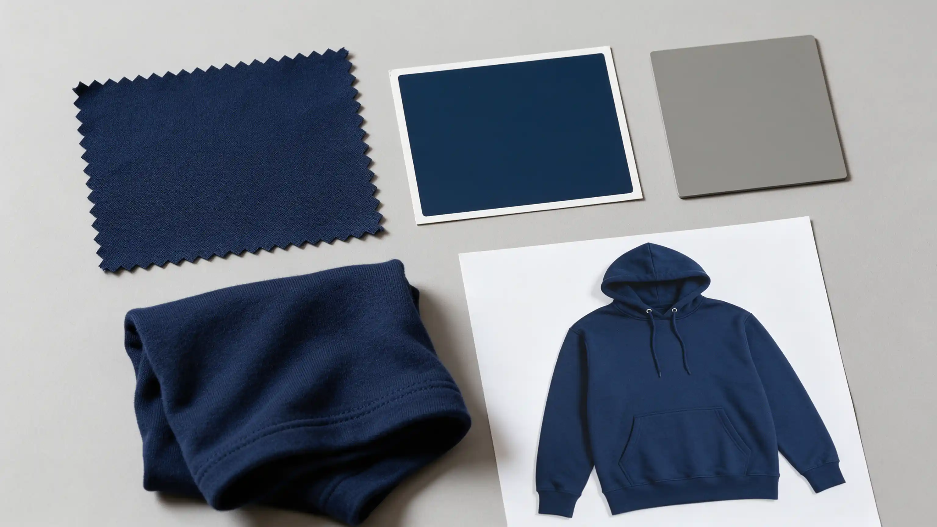
Illustrative example. Useful color references: physical sample, swatch, Pantone chip and approved master image.
When color variants make sense, and when they do not
A color variant is a new colorway created from an existing product photo. You photograph the product once and produce the other colors in post-production.
Variants tend to work well when:
- The product shape, fabric, and styling are identical across colors.
- The source image is sharp, well lit, and has full tonal detail.
- You have many colorways per product and a tight launch window.
- You want every color to sit under the same lighting.
Recoloring works best when the product's construction, material, lighting, styling, and image quality suit the transformation. Some products are better reshot, particularly:
- Highly reflective or metallic products, where the surface mirrors its surroundings.
- Transparent or translucent materials, where color interacts with what is behind them.
- Materials whose appearance changes significantly with color.
- Products with changed patterns or construction.
- Source images that lack enough tonal information to rebuild the new color convincingly.
What realistic recoloring involves
Professional recoloring is not applying a new hue over the product. A flat color layer replaces the information that makes the product look real. A convincing variant preserves:
- Luminance and tonal structure: the light and dark relationships that describe the shape.
- Texture: knit, weave, leather grain, and stitching.
- Highlights and shadows: the light should fall on the new color as it fell on the old one.
- Folds and form: the depth of the product should stay intact.
- Material characteristics: satin stays glossy, cotton stays matte, mesh stays open.
- Product edges: clean transitions with no halos or color fringing.
- Trims and hardware: buttons, zippers, labels, and logos keep their own colors unless the new colorway calls for a change.
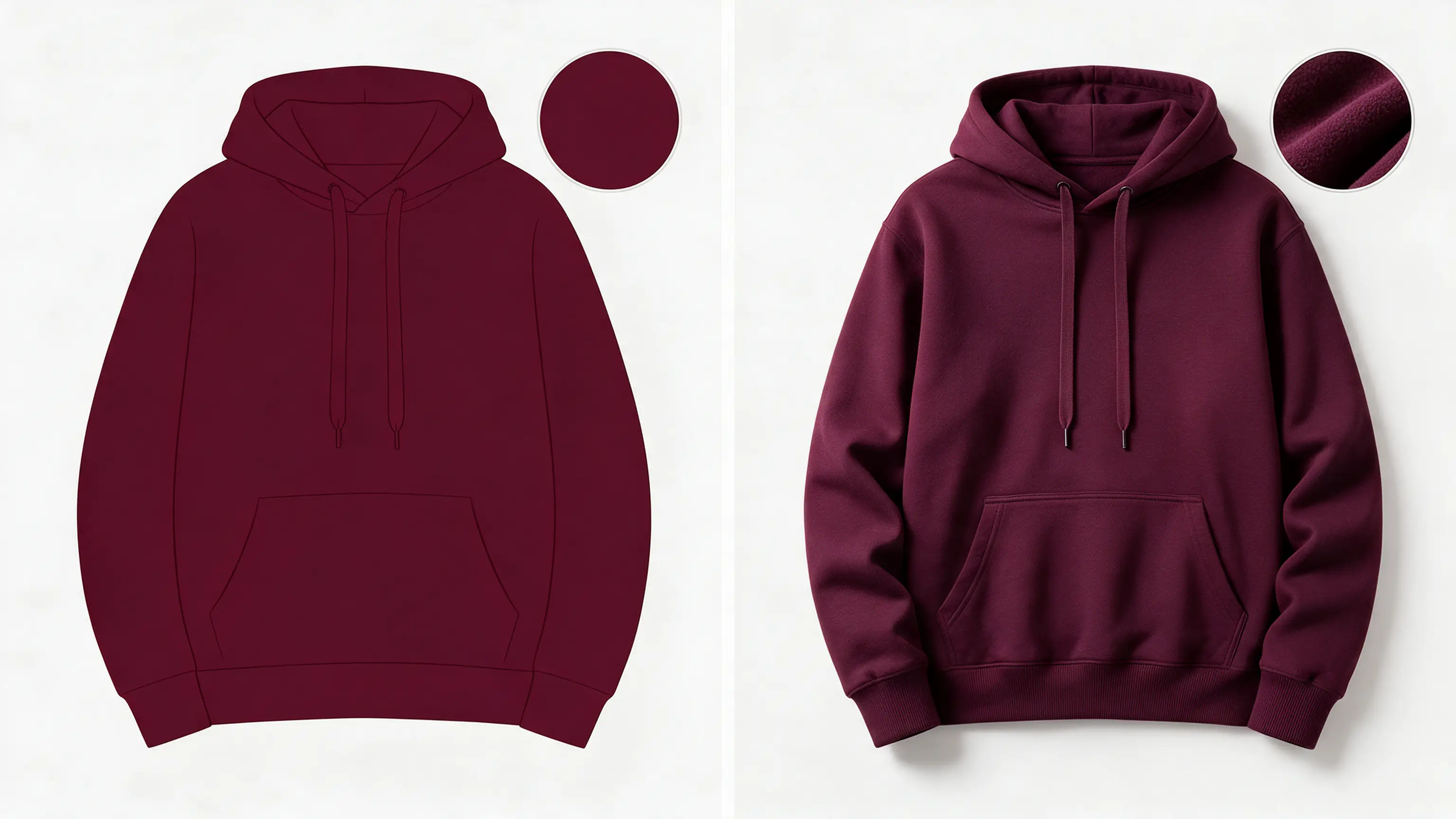
Illustrative example. Left: flat fill. Right: texture, highlights and shadows preserved.
Dark-to-light changes are the hardest. A black garment holds very little color information, and its folds and shadows sit close together in near-black tones. Making it light means re-establishing the tonal separation between those areas so the product keeps its shape. Raising brightness alone produces a flat, gray result. A skilled editor works with selective adjustments, masks, and luminance control, while keeping the original texture information so stitching and fabric detail carry through. Light-to-dark changes are usually more forgiving.
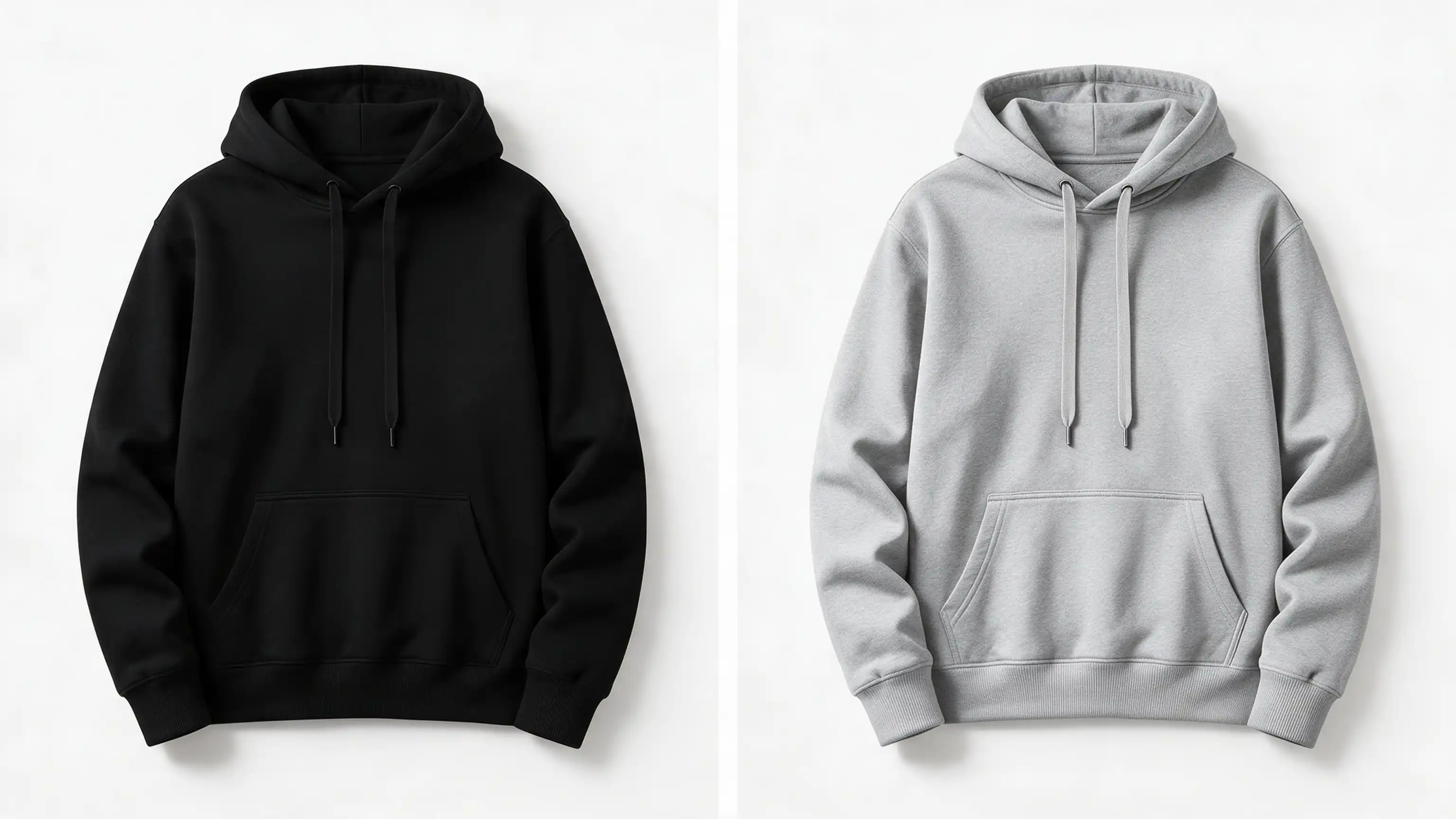
Illustrative example. Dark source image and the light variant built from it.
Common recoloring mistakes
| Mistake | What it looks like | The fix |
|---|---|---|
| Flat fill over the product | Texture disappears, product looks cut out | Layer and mask-based color editing |
| Ignoring original shadows | New color looks pasted on | Preserve the original tonal range |
| Dark to light jumps | Muddy, gray result | Rebuild luminance, not just hue |
| Recoloring trims and hardware | Zippers and logos change by accident | Precise selections and masks |
| No catalog comparison | Variants look like different ranges | Side-by-side QA against the reference |
Clean selections underpin all of this. They are the same skills used in clipping path and Photoshop masking work. When a product has several distinct areas, such as panels, trims, or contrast fabrics, multiple clipping paths let each area be selected and adjusted independently, so changing one color does not disturb the rest.
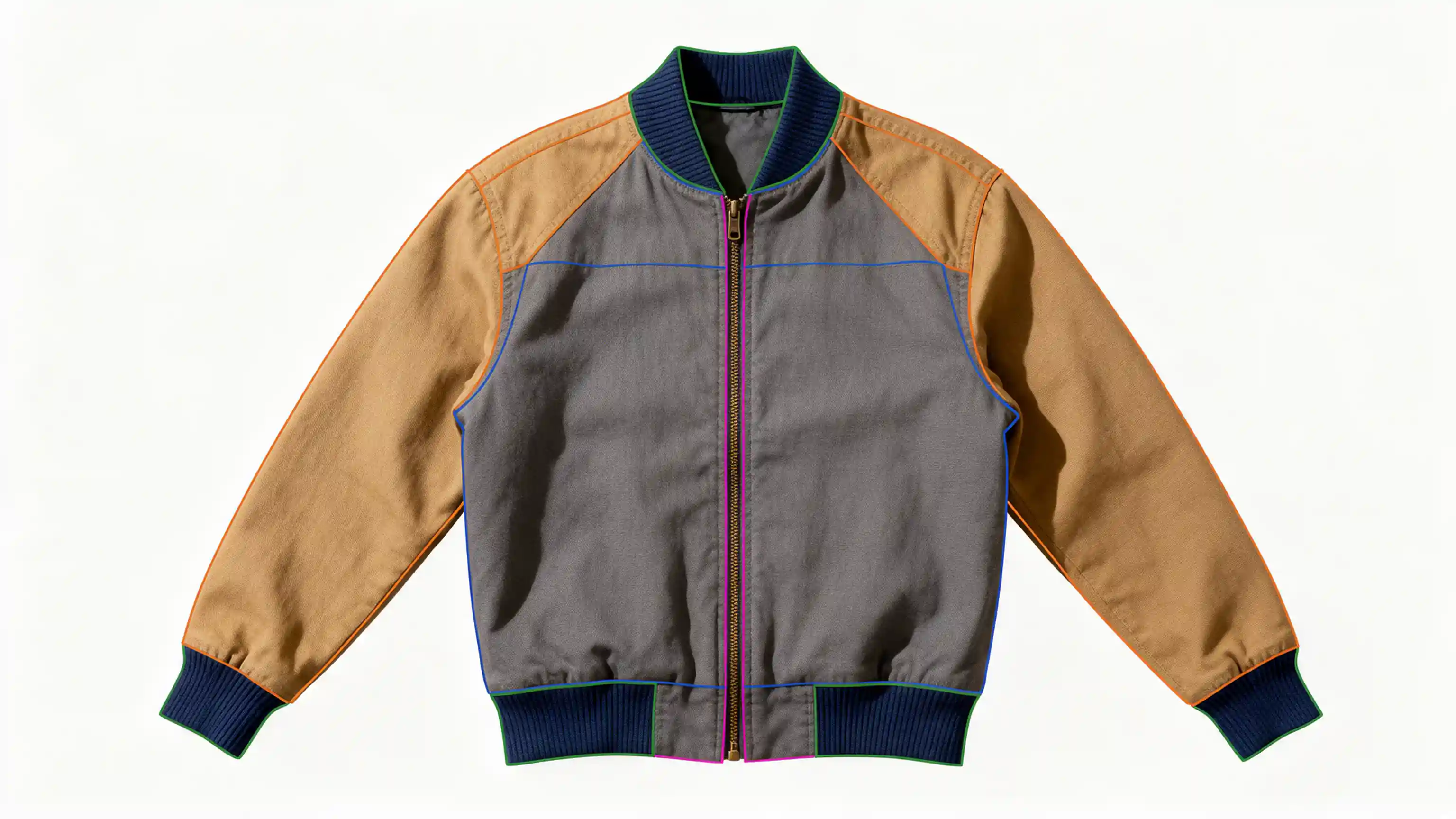
Illustrative example. Each area has its own path, so one color can change without touching the rest.
Color correction vs. color variation
- Color correction answers: "Does this image match the real product?"
- Color variation answers: "Can this product be shown in another color without another shoot?"
Most catalogs need both, in that order. Correct first, then create variants from the corrected master.
Typical project: Turning inconsistent product photos into one cohesive catalog
This is a representative example of a typical workflow. It is not a documented client project.
An apparel brand was preparing a seasonal product catalog with dozens of garments available in several colorways. The images had been produced across different shoots, using slightly different lighting setups and camera settings. Some colors had been photographed, while other planned colorways still needed to be created.
The problem was not that any single image looked obviously wrong. It was what happened when the images appeared together.
Before
Across the collection, similar colors did not always look as though they belonged to the same range. Navy shifted from deep blue to almost black, lighter fabrics picked up different color casts, and saturation varied between shoots.
The brand also needed additional colorways for several products. Photographing every missing variation would have meant preparing more samples, scheduling additional studio time, and repeating a shoot for products that were otherwise identical.
The catalog needed one consistent visual standard before the images could be published.
What we did
We began by establishing an approved reference for each product family. Those references became the standard against which every image and color variation was checked.
First, we corrected exposure and white balance across the original photography. This gave us a clean, accurate base instead of building new variations on top of existing color problems.
Next, we matched the photographed products to their approved colors and standardized the treatment across the collection.
For the missing colorways, we created new variants from the corrected master images using precise selections, layers, and masks. Instead of applying a flat color over the product, we preserved the original texture, stitching, folds, highlights, shadows, and material characteristics.
Details such as buttons, zippers, labels, and trims were isolated so they remained unchanged where required.
Finally, the completed images were reviewed together as a catalog rather than as individual files. Similar colors were compared side by side, and any image that looked too warm, cool, bright, dark, or saturated relative to the rest of the collection was adjusted before delivery.
After
The finished catalog looked as though the products had been photographed under one controlled setup.
Colorways were visually consistent across the collection, while fabric texture and natural lighting remained intact. Missing variants were created without requiring a separate photoshoot for every color, and the brand received a more unified set of product images ready for use across its ecommerce catalog.
Just as importantly, the workflow became easier to manage. Instead of correcting inconsistencies product by product after delivery, the entire collection followed one reference standard and one quality-control process.
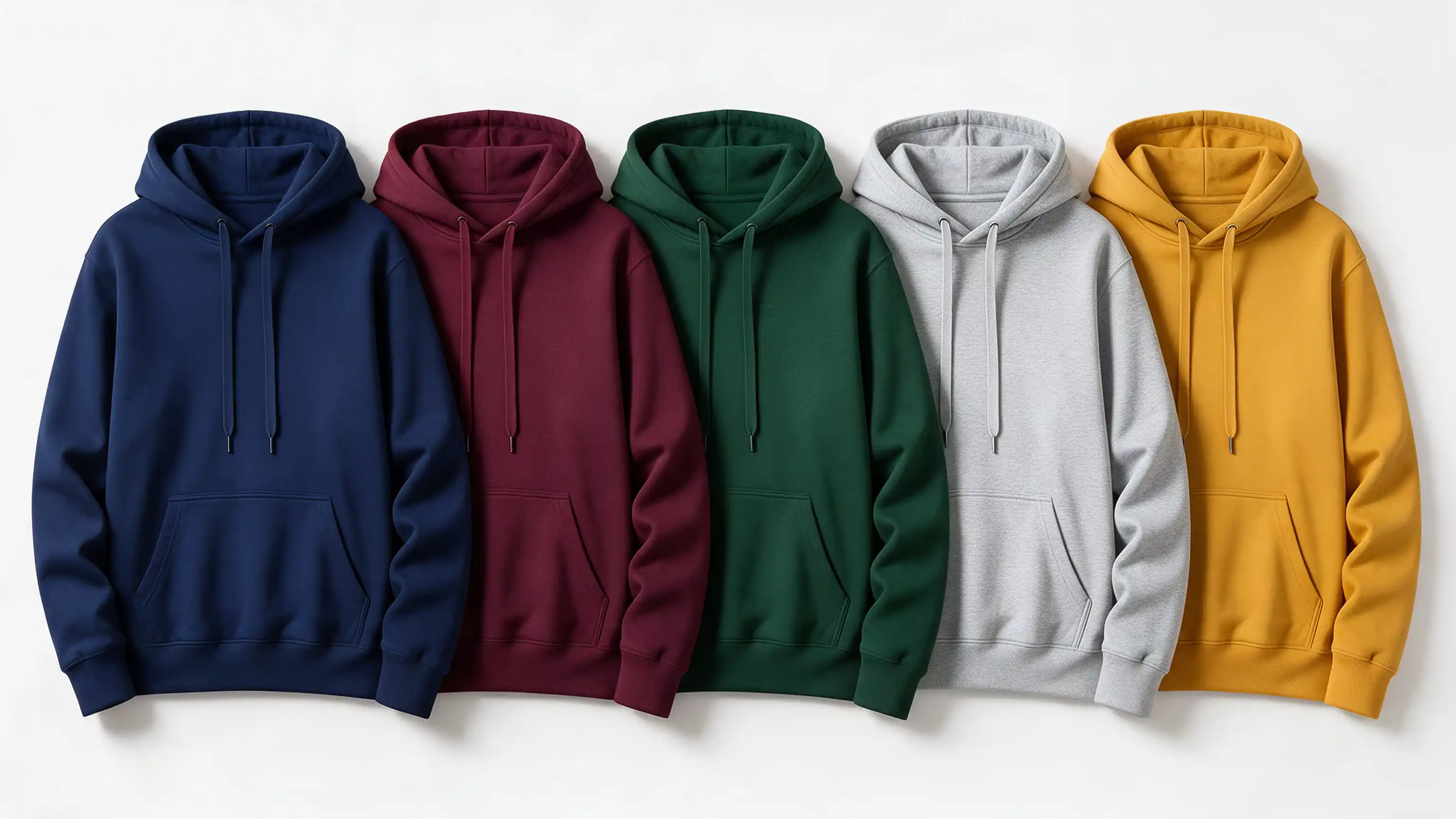
Illustrative example. Five colorways from one corrected master.
The takeaway
The biggest improvement was not simply changing the color of a few products.
It was turning photography from different shoots and different colorways into one coherent catalog.
By correcting the master images first, creating realistic variants from those approved files, and checking the complete collection side by side, the brand could expand its product imagery without sacrificing consistency or repeatedly returning to the studio.
Why brands bring catalog color work to ClippingPathService.com
Anyone can apply a color adjustment. What matters on a catalog project is who is making the selections and who is checking the set. Here is what we focus on:
- Human-edited work. Selections, masks, and color decisions are made by editors, not left to an automatic filter.
- Catalog-level consistency. We treat your images as one collection, so a color is judged against its neighbors, not only on its own.
- Precise masks and selections. Trims, panels, and edges are isolated cleanly, which is what keeps recolored products believable. See our photo deep etch and retouching services.
- Approved color-reference workflows. We work from your swatch, Pantone reference, or master image.
- Large batches. Catalog work usually means many files, and our pricing includes volume savings.
- A quality-control process that reviews finished images as a group before delivery.
- Support for complex color variations, including multi-area products where more than one part changes color.
- Flexible delivery. Layered PSD, PNG, or JPG files, so your team can keep editing or publish directly. If you sell on Amazon, we also handle Amazon product images.
Catalog quality-control checklist
Use this before images go live:
- Does each product match its approved reference color?
- Are neutrals (whites, grays, blacks) neutral?
- Do all variants of one product look like the same product family?
- Is fabric texture visible on every variant?
- Do highlights and shadows look natural on the new color?
- Have trims, zippers, and logos kept their intended colors?
- Do images from different shoots sit together without clashing?
- Are files exported in the color space and format your channels require?
- Has the full set been reviewed side by side on a calibrated display?
Any "no" is worth fixing before launch, since inconsistencies are easiest to correct before the catalog is published.
Edit or reshoot: a quick decision guide
Edit it when:
- The product shape and styling stay the same across colors.
- You need many variants on a deadline.
- Your base photo is sharp, well lit, and tonally complete.
Reshoot it when:
- The base photo is blurry, poorly lit, or has a color cast beyond reasonable repair.
- The new color changes how the material reflects or transmits light.
- The product itself has changed.
Test it on your most difficult product images
The best way to judge catalog color work is to try it on images that are hard to get right. Pick a few of yours, such as a dark garment that needs a light variant, a product with contrasting trims, or a set from different shoots that does not match, and send us:
- The original product images
- An approved swatch, Pantone reference, or master image
- Any color variants you need
Start from our free trial page and check the current terms there.