A great shoot doesn't guarantee a great gallery. Lighting drifts, exposure shifts between products, and different sessions never quite match-and by the time you're staring at 60 files that don't belong together, reshooting isn't an option. Here's the checklist we run on every inconsistent gallery that lands in our queue.
The problem at a glance
| What happened on set | What it looks like in the gallery |
|---|---|
| Lighting shifted between sessions or hours | Some products read warmer, some cooler, side by side |
| Reflective vs. matte materials lit the same way | One product overexposed, another underexposed |
| Multiple photographers, studios, or shoot dates | Every image has its own visual "accent" |
| Editing done ad hoc, image by image | Contrast, saturation, and shadow style drift across the set |
None of these are single-image problems. Each one only becomes visible once the gallery is viewed as a set-which is exactly how a client or customer will experience it, whether that's a buyer scrolling a lookbook or a brand reviewing the final delivery.
Why this shows up differently depending on what you're shooting
Consistency problems aren't identical across product categories, which is part of why generic advice ("just match the white balance") doesn't fully solve it. We see this across a wide range of categories-apparel, footwear, jewelry, electronics, furniture, cosmetics, food packaging, eyewear, handbags, and industrial equipment-and each behaves differently under the same lighting setup.
Metallic accessories and jewelry tend to read brighter than fabric or leather shot under the same light, and fine detail is the first thing lost when that goes uncorrected. Fabric color on apparel is especially sensitive to small lighting shifts between shots, which is why two garments photographed minutes apart can still need different correction even under supposedly identical lighting. This is exactly why our editing team treats correction as material-specific rather than applying one blanket adjustment across a whole gallery-it's the difference between a batch that merely looks edited and one that looks like it belongs together.
Why this is a batch problem, not an editing problem
Any competent editor can correct one photo. The actual job is making 40, 400, or 4,000 images match a single standard without an obvious "corrected" look. That's a production discipline, not a Photoshop trick-and it's the same principle we apply whether the gallery is 20 product shots or a 1,200-image bulk order.
In practice, that discipline comes down to a two-stage review, and it's the core of our quality control process. An editor on our team completes the correction pass on a file, and a separate reviewer checks it against the original brief before it's marked done. If a batch doesn't pass that second check, it goes back for correction before delivery rather than shipping as-is. That second, independent set of eyes is what actually catches the kind of drift that's invisible when you're looking at one image at a time but obvious the moment the whole gallery is viewed together.
"We handle large batches daily, and consistency is critical for us. Their team delivers clean, accurate results every time without requiring revisions."
- James Carter, E-commerce Manager
The 6-point post-shoot consistency checklist
Run your gallery against each of these before you decide it needs a reshoot.
- Lock a hero image first. Pick 2–3 approved reference images that define the target exposure, color, and background before editing begins. Every other image gets matched to these-not corrected in isolation. If you shoot with the same provider regularly, these preferences can be stored against your account so future batches start from the same standard automatically, instead of being redefined from scratch every time.
- Match exposure across materials, not just across shots. A white shirt, black bag, and metallic accessory reflect light differently even under identical lighting. Exposure correction has to account for the material, not just apply one blanket adjustment across the whole set.
- Correct white balance to the product's real color, not the camera's. Camera and lighting color temperature shifts are common between sessions. The test isn't whether the image looks good alone-it's whether the color matches what actually ships to the customer.
- Standardize the background. Pure white is the most common standard for a clean e-commerce look, but what matters most is matching your brand's approved background and keeping product framing consistent across images. Mixed background tones or inconsistent framing across a gallery are some of the fastest ways a collection reads as unfinished, even when each photo is technically fine.
- Pick one shadow treatment and apply it everywhere. Natural shadow, drop shadow, or none-any of the three works. What doesn't work is mixing them within the same product category or across a single collection.
- Check skin tone consistency on lifestyle and portrait sets. If your gallery mixes product shots with people wearing or presenting the product, skin tone drift between sessions is just as visible as fabric-color drift-and it's the detail most consistency checklists skip entirely.
Multi-SKU and color-variant consistency
There's a seventh scenario worth calling out separately, because it's common and easy to miss: a single shoot that covers multiple color variants or components of the same product. A handbag shot in three colorways, or a garment photographed with its strap, buckle, and lining as separate design elements, needs each part treated as its own path rather than as a single flat cutout. This is what multi-path clipping is built for-separating individual elements of an image into independent layers so each variant or component can be color-matched, replaced, or adjusted on its own without disturbing the rest of the image. Skipping this step is a common reason color variants of the "same" product end up looking inconsistent with each other in a catalog, even when each photo looks fine on its own.
Run this audit before you send anything out
You don't need special tools to find out how bad the drift actually is:
- Pull the full gallery into one grid view-not just your best images. Inconsistency hides on individual product pages and shows up immediately side by side.
- Zoom to 100% on your locked hero image, then compare three others against it. Note where exposure, color, or background tone drifts.
- Check fine edges-hair, straps, transparent packaging-for halos or leftover pixels if any background removal has already been attempted.
- Hold a physical product next to its photo. Confirm the color on screen matches what actually ships.
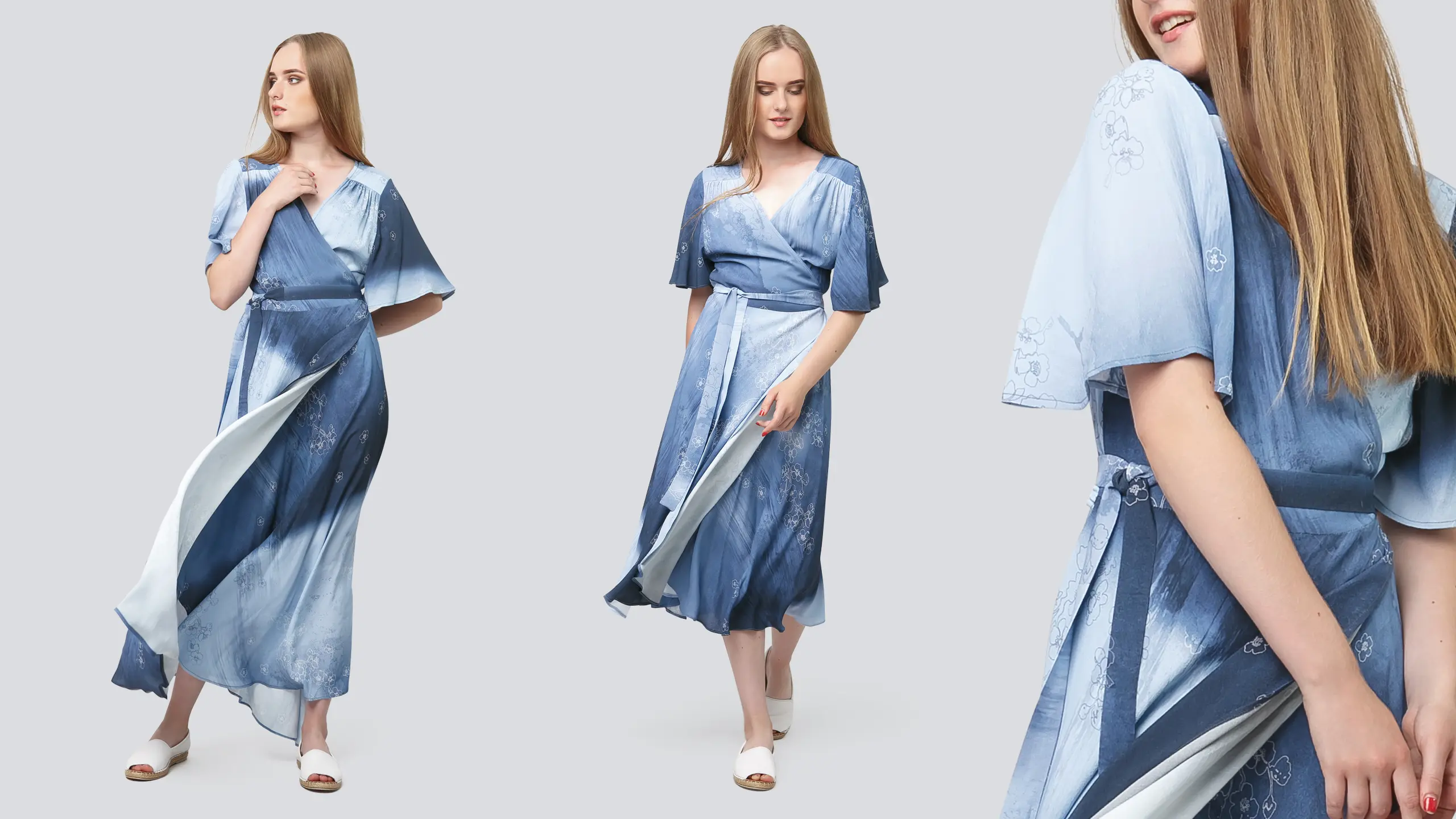
- If you're shooting apparel with multiple variants, lay the color versions side by side and check whether the color difference between them is real or just a lighting artifact from the shoot.
If step two makes the gap obvious, that's your starting point-and it's fixable without reshooting.
What we actually do with a gallery like this
We don't run inconsistent batches through automated tools. Every clipping path and correction is done by hand, which is also why we don't offer AI-based batch editing-it's a deliberate choice, not a limitation.
Our retouching workflow for a job like this is: lock the hero images, apply matched exposure and white balance by hand across the full set, standardize background and shadow treatment to your brand's requirements, and then run it through our two-stage quality control process before delivery. That work is done by our experienced editing team of 250+ professional retouchers, which is also what makes the same discipline hold whether the batch is 20 images or several thousand-it's the reason clients send us recurring work rather than one-off jobs. This is also how we handle large galleries specifically: files are typically delivered in structured groups throughout the process rather than all at once at the end, so you can start using finished images before the full order is complete.
"Turnaround time is impressive. Even urgent projects are delivered on time without compromising edge quality or detail."
- Sophia Martinez, Creative Director
If anything in the delivered set still doesn't match your brief once you review it, that's what revisions are for-corrections against your original instructions are handled at no additional cost, not treated as a new job.
Why this matters more now, not less
Product photo consistency has always been a brand-presentation issue-the difference between a gallery that looks like a cohesive collection and one that looks like a pile of files. That's worth keeping in mind as more shopping happens through AI-powered search and comparison tools: clear, consistent product imagery helps create a stronger product presentation across these modern search and shopping experiences, the same way it always has for a human browsing your site. (We cover this shift in more depth in our guide to preparing product images for AI-driven shopping, if you'd like to go further into it. )
What to send us
- RAW files where possible (TIFF also accepted)-JPEG has already discarded the data a full correction needs
- 2–3 reference images showing your target look
- Brand guidelines, if you have them-exact product colors, approved background, previous campaign references, and any style instructions (background color, shadow type, margins, output format) you want applied consistently across the batch
We also accept JPG, PNG, and PSD directly and deliver in layered PSD, PNG, or JPG depending on what your team needs downstream. For batches beyond a couple hundred images, a shared cloud folder (Google Drive, Dropbox) tends to work better than direct upload or email, since both sides can track progress against the full count as files come in.
FAQ
How fast can you turn around an inconsistent gallery? Turnaround depends on the tier: Express (1 hour), Rush (4 hours), Prompt (10 hours), or Regular (24–48 hours), with Regular starting from $1 per image. Rush tiers carry a surcharge, reflected in your quote before you commit.
Do you use AI to fix inconsistent photos? No. All clipping path and retouching work is done by trained human editors-this is a deliberate standard, not an add-on option, and it's why batch consistency holds across large galleries.
Can I test quality before sending a full shoot? Yes-free sample work is available before you commit to a full order.
What files should I send? RAW or TIFF for maximum correction flexibility, plus 2–3 reference images. JPG, PNG, and PSD are also accepted.
Is my shoot confidential? Files transfer over SSL and are stored on access-controlled servers. NDAs are available on request.
What if the delivered images still don't match my brief? Corrections against your original instructions are free-if something doesn't match what you specified, flag it, and it gets re-edited rather than treated as a new charge.
Will you remember our brand's style preferences for future batches? Yes. Style instructions-background, shadow type, margins, output format-can be stored against your account so recurring orders start from the same standard without having to redefine it each time.
Do you handle multiple color variants of the same product in one batch? Yes, through multi-path clipping, which separates individual elements or variants into independent layers so each can be matched and adjusted on its own without affecting the rest of the set.
Get your gallery matched
Send your files and reference images, and we'll return a sample so you can see the match before committing the full batch.